Statistical Graphs in R
A good graph can convey information more than words. The Napoleon's march to Moscow graph by Charles Minard is widely believed to be the most famous statistical graph.
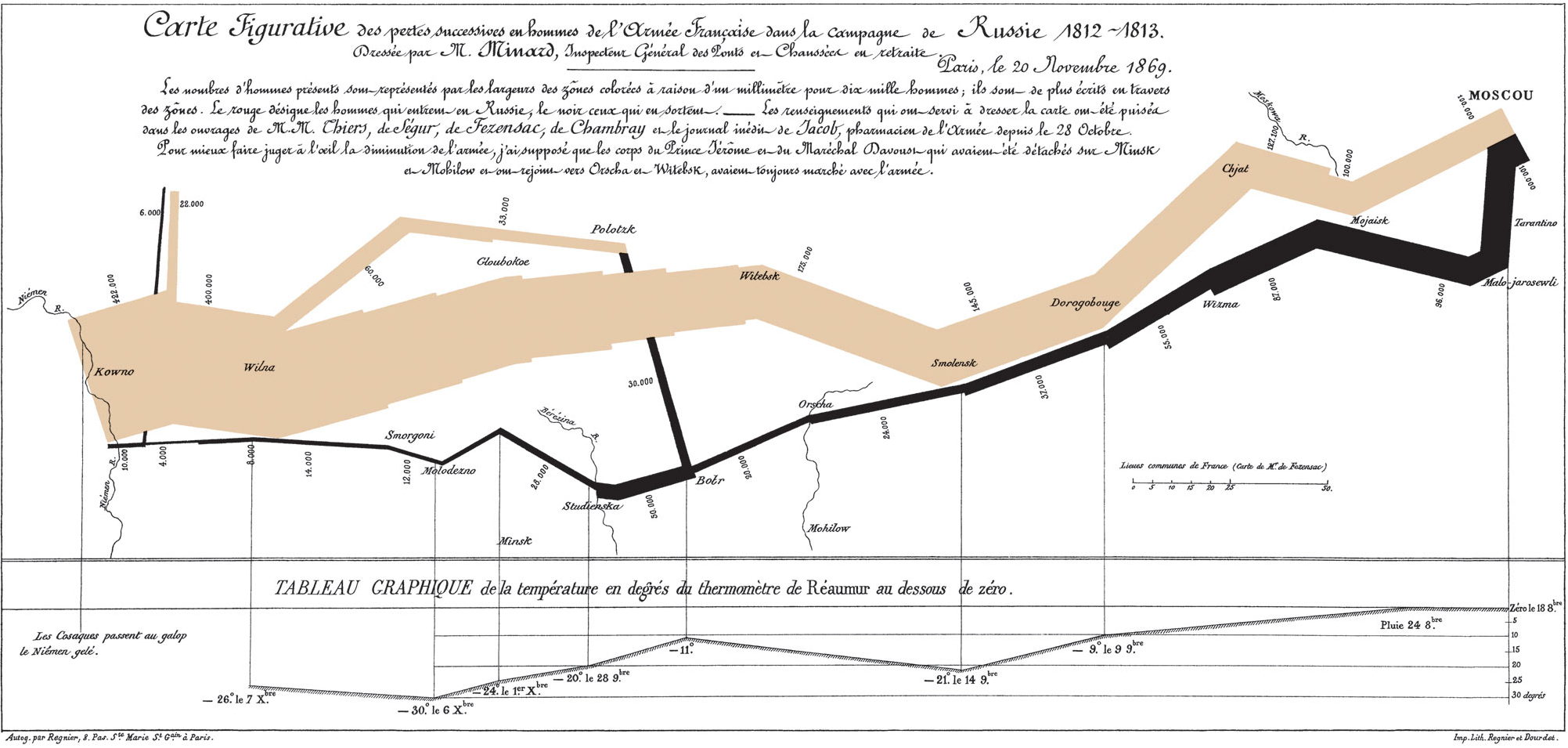
Tufte (1983, p.40) described the graph as follows.
Beginning at the left on the Polish Russian border near the Nieman River, the thick band shows the size of the army (422,000 men) as it invaded Russia in June 1812. The width of the band indicates the size of the army at each place on the map. In September the army reached Moscow, which was by then stacked and deserted, with 100,000 men. The path of Napoleon’s retreat from Moscow is depicted by the darker, lower band, which is linked to a temperature scale and dates at the bottom of the chart. It was a bitterly cold winter, and many froze on the march out of Russia. As the graphic shows, the crossing of the Berezina River was a disaster, and the army finally struggled back to Poland with only 10,000 remaining. Also shown are the movements of auxiliary troops, as they sought to protect the rear and flank of the advancing army. Minard’s graphic tells a rich, coherent story with its multivariate data, far more enlightening than just a single number bouncing along over time. Six variables are plotted: the size of the army, its location on a two-dimensional surface, direction of the army’s movement, and temperature on various dates during the retreat from Moscow.
To cite the book, use:
Zhang, Z. & Wang, L. (2017-2026). Advanced statistics using R. Granger, IN: ISDSA Press. https://doi.org/10.35566/advstats. ISBN: 978-1-946728-01-2.
To take the full advantage of the book such as running analysis within your web browser, please subscribe.